Doing a comic book adaptation of a novel must be a huge undertaking. There’s an awful lot of content crammed into a novel’s pages, much of which is subtle and doesn’t necessarily fit well with graphic representation and limited dialogue/text boxes to tell the story. To make things more complicated, Damian Duffy (adapter) and John Jennings (illustrator) decided to adapt Kindred, a complex science fiction time travel narrative addressing issues of race and slavery. That’s hardly an easy subject to tackle at the best of times.
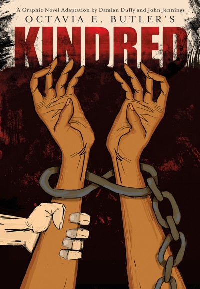 For those uninitiated – their lives all the poorer for it – Kindred is the story of a Black woman from the 1970s being transported back in time to save the life of her white ancestor. While she is back in the slave-owning south of the 1880s, she attempts to bring a little 20th-century enlightenment to the embedded racism and sexism of the time. What makes Kindred such an intense story is the way Octavia Butler explores the ease in which one can become comfortable with such egregious injustices as slavery.
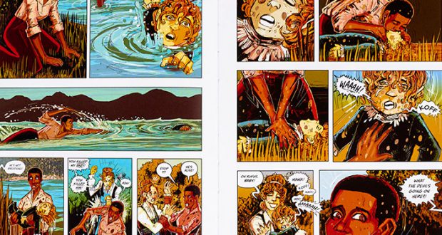
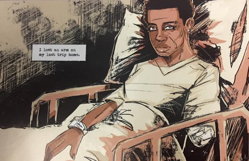
This adaptation did not particularly work for me. I felt that the subtleties allowed in a prose narrative were lost in the graphic novel so that the overall story lost its emotional impact. Having said that, I’d like to clarify that I believe that comics/graphic novels have just as much ability to present deep and affecting stories as novels, but in this case, it didn’t work. Too much of the protagonist’s inner monologue had to be included for the story to remain comprehensible, forcing the highly visual medium to have an inordinate amount of text. The visuals became secondary and weren’t always necessary or particularly complementary to the narrative.
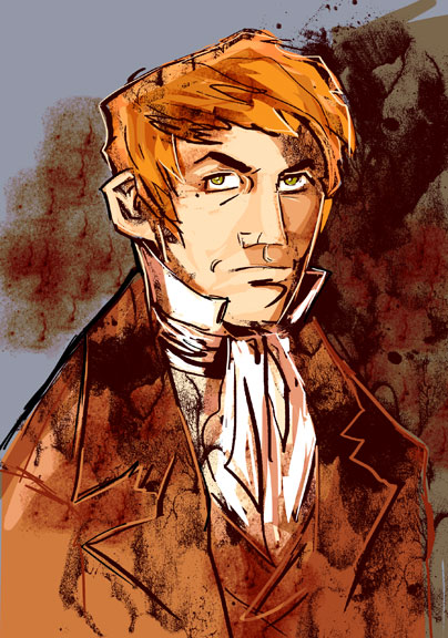
In novel writing, they tell us to ‘show don’t tell’. Unfortunately, while reading this adaptation of Kindred, it felt as though it were almost all ‘tell’. Much of the original narrative is borne out of Dana’s personal reaction to what she sees happening around her, which is translated here into the textual internal monologue. But instead of presenting the reader with truly affronting images, to make them have similar responses to Dana as she explores the past, the images shy away from any real brutality. Jennings’ art in general doesn’t sit well with me for this narrative. It has that kind of chicken-scratch, impressionist feel which takes away from the visceral narrative. Part of what makes Kindred so moving is how real it feels despite the fantastical nature of the situation. By using artwork that dilutes the reality of this dark tale, I felt the overall impact of the story suffered.
 It is always difficult to approach an adaptation of something you love. Just like with a film adaptation of a beloved book, I have to ask – why adapt Kindred to the graphic novel format? I don’t think having illustrations particularly adds to the narrative nor is this adaptation anything but a close-as-possible version of the original story. So why did they feel it necessary to create this adaptation? I can’t see any reason for it other than to cash in on an already successful and well-loved story. Call me a cynic, but really, if it doesn’t demonstrably add to what is already in existence, why bother?
Verdict: The original novel is far superior to this adaptation that adds nothing to an almost perfect story of racism, misogyny, and how easy it is to be sucked into destructive ideologies.
The graphic novel adaptation of Kindred comes out on January 10th from Abrams ComicArts.
 Pop Verse Pop Culture Universe
