This is an interesting return to cinemas for a film whose reputation is already outlasting a lot of its peers from 2015. Mad Max: Fury Road finds itself at cinemas once more, this time screened in the monochrome version that was included on one of the DVD releases. The black and white cut has been dubbed Black & Chrome for this special edition and helps to secure the already formidable legacy of arguably the greatest action blockbuster we have seen in decades.
If you can’t tell from the above, I really rate Fury Road. It might be light on character and plot, but its technical mastery, its narrative efficiency and its thought-through thematic elements put it so far above any of the garbled and undisciplined explosion-fests otherwise on at the multiplex. It is as if George Miller, now in his 70s, looked at all the young ‘uns making a pig’s ear of popular action cinema and declared authoritatively, ‘No, this is how you do it!’
I will carry you myself to the gates of Valhalla
 Miller had apparently wanted the film to be shot and distributed in black and white. He views the Black & Chrome edition as the superior cut. This comes as something of a shock given the powerful contrast and colour saturation that was employed to great effect in the theatrical cut. Some bemoan the universal employment of the contrast between orange and teal in modern film-making, but here at least was an example of the colour-coding done right. It is impressive to say that the film wonderfully captures a bleak and unforgiving world that is not conveyed by washed-out browns, but by vibrant and violent hues.
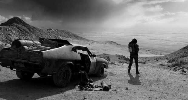
Black & Chrome is a damn fine-looking film though and it has some aesthetic merits that are all its own. The black-on-white scheme of the warboys looks particularly good, the sandstorm sequence was, if anything, given more clarity in this cut, and the scene of Furiosa collapsing on her knees in the sand is now an even more powerful and stark image.
You will ride eternal, shiny and chrome!
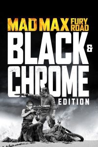 No doubt though, something has been traded in one area to be gained in another. What we have then is a change in emphasis and acute change in tone. Miller has expressed that he wanted to rescue monochrome from being the sole-reprieve of art-house cinema, and more power to him if he can reclaim it for mainstream movies with such style. Some might feel that Fury Road carries more gravitas for this alteration though.
In truth though, I don’t want to emphasise the difference too much. This is still Fury Road and has had no other edits, cuts or alterations to embellish the cinematic experimentation. This is not like a Ridley Scott director’s cut with substantial scenes added, it’s not the unseen extreme version, and it’s not the ridiculous Peter Jackson extended-edition. This is the original film in monochrome so the experience is very much in the same approximate ballpark. It’s an interesting experiment in the effects and use of drastically different colour palettes and saturation on screen but this will neither hamper nor convert established fans or critics of the film. Fury Road remains it’s incorrigible and berserk self and I happily welcome another chance to see it, especially with an interesting new twist.
Verdict: Black & Chrome does not remake the experience, but it’s a chance to get a different spin on Fury Road’s fierce visuals.
 Pop Verse Pop Culture Universe





100% agreed on how AWESOME this movie is. Not a lot of movie has titles that speak for itself. It was furious in all senses (unlike Fast and Furious where it is more physical adrenaline than emotion sometimes). But why does the poster have colour?